
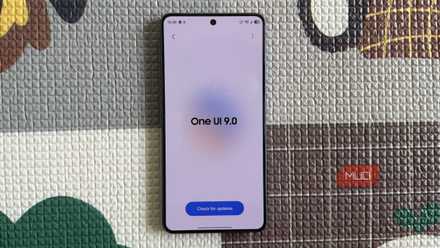
Samsung’s One UI doesn’t do subtlety. It gives you an endless array of grids, folders, widgets, and edge panels—enough toggles to make setting up a clean home screen a project in itself. I like that flexibility, but my home screen had become a tiny shopping mall of icons and good intentions.
So I installed Niagara Launcher on my Samsung phone, mostly to see why Android minimalists keep recommending it. After a few days, I understood the appeal. Niagara did not make my phone more exciting. It made it boring and that was exactly what I needed.
The grid finally lost the argument
First impressions after killing my Samsung home screen
Niagara replaces One UI Home as your phone’s launcher, meaning the home screen and app access change while the rest of Samsung’s software remains intact. It gives you a vertical list of favorites and an alphabetical rail along the opposite edge; that’s basically the whole interface. The traditional grid-style app drawer is gone, and every app outside my favorites lives in an alphabetical index that I can scrub through with my thumb. On my Galaxy phone, which usually forces me to shuffle my grip, having the interaction rail run down one side felt correct in a way One UI Home never really did.
The first day was awkward. My thumb kept jumping toward the old spots One UI had trained into it, because my Samsung setup had become a familiar little maze. I had daily apps on the main page, widgets on another page, and folders full of apps I did not want to delete but apparently did not want to look at either. Samsung gives you plenty of ways to organize apps on a Galaxy phone, and none of that makes One UI bad. Samsung’s launcher is polished, flexible, and generous if you like dense home screens with plenty of control, especially if you enjoy personalizing your Samsung phone.
That was also the problem. On One UI Home, I could always reduce clutter by adding another page, folder, or widget. Niagara does not give me that escape hatch so easily. It made me choose what deserved to be visible, which was mildly annoying until I realized that was the whole point.
I spent the first few hours mildly irritated, then I stopped thinking about what had disappeared, and after that, I started liking it. The muscle memory hurdle is real, and it’s where you might bounce off. However, there’s a high chance that if you push through the first two days, you’ll find that the visual calm becomes the point rather than the problem.
Minimalism only works because Niagara is still practical
The trick is hiding power without burying it
A minimalist launcher can only get away with being this sparse if the basics are excellent, and Niagara understands that. It is not just a pretty list with a moral superiority complex.
The Wave Alphabet is the marquee interaction, and it is the feature I stopped noticing fastest, which is the highest compliment I can pay it. You slide along the alphabet on the side of the screen, and the app list flows under your thumb. On a tall Samsung phone, that one-handed interaction is bliss. I did not have to stretch toward the top of the screen, open the app drawer, or swipe through pages. I could jump to WhatsApp, Spotify, Gmail, or Settings with less thumb gymnastics than my old grid required.
Niagara also comes with a beautiful, Blackberry-like feature called integrated notifications. It can show notifications on the home screen, and in supported apps, you can read and reply without opening the full app first. And boy, did it change my rhythm of checking messages. I could deal with a message from the home screen instead of launching the app, seeing other chats, and suddenly remembering five unrelated things.
Niagara’s notification previews depend on Android’s notification dots or app icon badges being enabled, so you may need to check Settings > Notifications > Advanced settings > App icon badges (toggled on) if previews do not appear.
Niagara can also bundle selected notifications into a summary, which is useful for alerts that matter eventually but do not deserve immediate attention. Rather than treating it like a focus-mode scheduler, it is better to think of it as a slower notification lane that delivers batches roughly every six hours. That makes noisy apps easier to demote without completely muting them.
Then there are pop-ups, which are Niagara’s smarter answer to folders. Instead of creating square boxes full of tiny icons, you can swipe on an app to reveal related apps, shortcuts, notifications, or widgets, depending on how you set it up. Some of the deeper organizational features sit behind Niagara Pro, including fuller pop-up folder controls, widgets within pop-ups, and app list pop-ups, so you should know that the free version gives you the core launcher experience, not every advanced toy.
Talking more about Niagara Pro, you get built-in calendar and weather widgets, widget stacks that fan up to four widgets in one slot, custom fonts, additional icon packs and themes, and Usage Breaker screen-time reminders. It is available as a subscription or a one-time purchase, so it is worth knowing that Niagara’s best idea is free, but its best refinements are not.
My phone became less exciting, which was exactly the point
Boredom is underrated when your phone is always awake

When your home screen is a wall of colorful icons and live widgets, there is always something begging for a tap. When it is six favorites, a clock, and a strip of gray letters, the urge to browse has far less to feed on. That’s the biggest thing I took away after spending real time with Niagara.
My favorites list actually got shorter the more often I used Niagara. Apps that had been sitting there out of habit slowly lost their place, while the ones that remained were the apps I genuinely opened every day. Impulse app-hopping did not magically disappear, but it now requires just enough extra effort to make me pause, and I paused often enough to put the phone back down.
Niagara is not a digital well-being miracle, and I won’t promise it replaces actual self-control or Android’s Digital Wellbeing tools. My phone is not faster in a benchmarking sense either. It simply becomes faster to move through because fewer visual decisions are waiting to trip you up.
The caveat belongs in the same breath. If you love a dense widget wall, have built an elaborate Good Lock and Theme Park setup, or rely on Samsung-specific home screen layouts, Niagara will feel like a downgrade rather than a reset.
- OS
-
Android
- Price model
-
Free w/in-app purchases
- App Type
-
Launcher
My Samsung phone did not need another spectacle
After living with Niagara for a bit, I don’t think of it as a launcher that makes Android minimal for aesthetic reasons. Its best trick is that it makes the useful parts of my phone easier to reach while making the distracting parts slightly less eager to ambush me.
One UI is still powerful, and I understand why many Samsung users will stick with it. Niagara just pushed my phone in a direction Samsung’s default launcher does not naturally encourage — fewer surfaces, fewer decisions, and fewer icons pretending to be urgent.